

WELCOME TO THE CARSHINE BLOG
CARSHINE BLOG

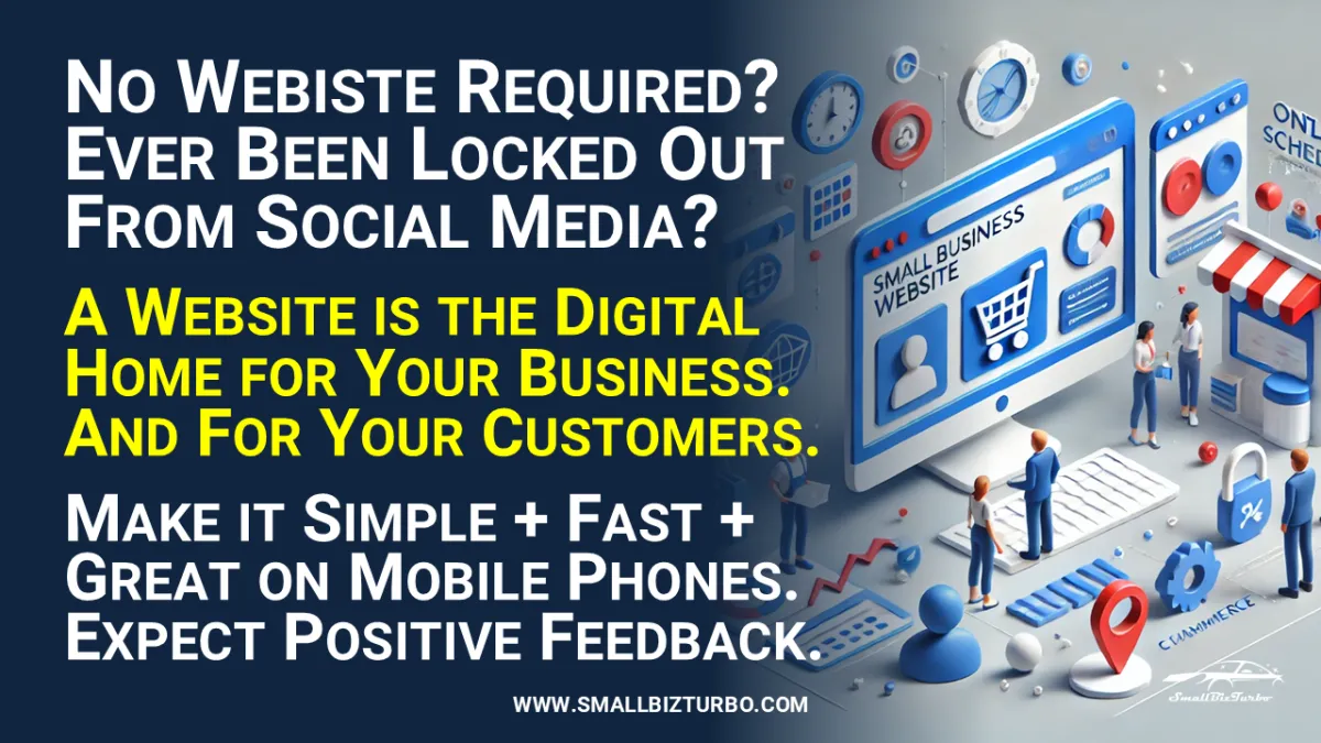
Five Reasons a Scroll-Down Website is Best for Small Business
In the digital age, every small business needs a website. It’s the first place potential customers look to gauge whether your business is legitimate and professional. But not all websites are created equal. While some small businesses rely solely on social media, others opt for complex websites with multiple layers of navigation.
However, there's a growing trend toward simple, scroll-down websites. These sites offer a user-friendly, visually engaging experience that drives conversions and keeps customers coming back. In this article, we’ll explore five reasons why a scroll-down website is the best choice for your small business.
Why a Website is Better Than Social Media Alone
A lot of small businesses make the mistake of relying only on social media. After all, platforms like Instagram and Facebook are free and have millions of users. But here's the thing: You don't actually own your social media page. Any changes in algorithms can really impact your reach, and your audience is always distracted by competing content. While social media is great for getting noticed, it's not the only way to build long-lasting customer relationships.
A website, especially one that scrolls, is the digital heart of your business. It's a place where you get to call all the shots when it comes to the customer experience. With a website, you're not at the mercy of social media algorithms. You have complete control over your branding, messaging, and user experience. When someone visits your website, they get a clear, uninterrupted view of who you are and what you offer.
Plus, having a website makes you look more credible. People are more likely to trust businesses with a professional-looking website. It shows that you're a serious, established business. A website that lets people scroll down to see more info makes it easier for them to get the information they need. With one continuous scroll, visitors can see all the info they need, like your services, testimonials, and contact details. It's a much more reliable experience than having to piece together bits of info from various social media profiles.
Search engines like Google also tend to rank websites higher than social media profiles in search results. This means that even if you've got a great social media presence, without a website, your business won't perform as well in search results. A website that scrolls down is a great way to get people to find you online. It's got all the info they're looking for, and it looks good on mobile too. In today's competitive market, businesses need to have every advantage they can get, and a well-optimized website is a great way to gain that edge.
A website that scrolls down isn't just functional - it's memorable. The simple act of scrolling makes it easy for customers to take in your key messages. With fewer things to distract them and a clear path to take, they're more likely to engage with your business. It doesn't matter if they're looking at your services or reading reviews—they can find everything they need just by scrolling.
The Risks of a Poorly Designed Website and Over-Reliance on Social Media
It can be a big mistake for a business to rely too much on social media or have a poorly designed website. Social media platforms are always changing, so businesses have to keep up with the times to stay relevant. What happens when you lose followers or people aren't engaging with your content? You lose touch with your audience. Even worse, you don't have complete control over how your brand is presented. There's a lot of noise on social media, and your brand could get lost in the shuffle.
But let's talk about websites for a moment. A poorly designed website can be just as damaging as having no website at all. Picture this: You land on a site with outdated info, broken links, or confusing navigation. Your first thought is to leave. That's the same experience your potential customers have when they visit a bad website. If your site takes too long to load or looks unappealing, visitors will leave and you'll lose out on business.
A confusing website layout is like walking into a cluttered store. You're not sure where to go or what to look for, or how to find what you need. Your customers expect a smooth, effortless experience when they visit your website. If your website can't provide that, they'll go somewhere else. Even worse, they might never come back. If your website looks bad, customers will think you don't care about your business. That's a tough impression to overcome.
If your website looks out of date or too complicated, it'll make people think you don't know what you're doing. It makes customers think you're not up to date or that you don't care about their experience. This lack of professionalism can hurt your brand and make potential customers think twice about doing business with you. In today's world, first impressions matter. That means your website has to look polished, be easy to use, and look good.
One way to make your website more user-friendly is to eliminate the complexity by using a scroll-down format. Instead of overwhelming your visitors with menus, categories, and lots of pages, a scroll-down website puts all the key info in a simple, easy-to-read format. With every scroll, visitors get drawn deeper into your brand story, learning about your services, testimonials, and mission without having to click through endless pages. It's a design choice that keeps visitors on your site longer and makes sure they leave with a good impression.
The Advantages of a Simple Scroll-Down Website
Why go for a scroll-down website over a more traditional, multi-page site? The answer is straightforward: it's easier to use. Today's consumers want instant access to information. They don't want to spend time searching through menus or jumping from page to page to find what they need. A scroll-down website gives them everything they want without any hassle.
When people come to your site, they want to find out about your business pretty quickly. A scroll-down website makes that easy for them. They don't have to search through different sections or wait for multiple pages to load. All the important info—like your services, products, testimonials, and contact details—is right there, ready to be found in one smooth scroll. This makes it easy for visitors to find what they're looking for, which gets them engaged and encourages them to explore more of what you have to offer.
A scroll-down website is also great for mobile users. These days, more than half of all internet traffic comes from mobile browsing. And mobile users want websites to be fast and easy to navigate. Traditional websites with their multi-layered menus and slow-loading pages can be a real pain to use on a mobile device. A scroll-down site is designed to look great on mobile. You don't have to zoom in or mess around with navigation bars. Everything is right there at your fingertips.
Simplicity also means faster loading times. Fewer pages mean faster load times, and in today's fast-paced world, speed is key. If your website takes too long to load, people will leave before they even get a chance to see what you have to offer. Scroll-down websites are quick and easy to use, giving customers the information they need without any fuss.
A simple website also shows that your business is professional. People like a website that gets to the point. There's no confusion or unnecessary distractions—just a clear presentation of what your business does and why they should care. This simple, straightforward approach helps build trust with your audience, which in turn increases conversions.
The Positive Impact on Your Business, Employees, and Customers
When you invest in a scroll-down website, you're not just boosting your online presence—you're also laying the groundwork for future business growth. A great-looking website makes you look more credible, makes customers happier, and can even make your day-to-day operations more efficient.
For business owners, a scroll-down website makes it easier for customers to find what they're looking for. You don't have to worry about potential customers getting lost in a maze of links. Your site provides a clear, linear path, so you can rest assured. With all that worry out of the way, you can focus on what matters most: growing your business and serving your customers.
Your employees will also see the benefit. A solid website can take on a lot of the same tasks that staff would otherwise need to do. For instance, a scroll-down site can show the most common questions, highlight the services you offer, and even capture leads through contact forms. This lightens the load on your team, so they can focus on providing excellent customer service.
Your customers will notice the difference, too. A scroll-down website is simple to use and provides a smooth experience from start to finish. No matter if they're on a computer or a smartphone, they'll find what they need quickly and easily. This makes it more likely that they'll take the next step, whether that's making a purchase, scheduling an appointment, or contacting your business for more info.
All in all, a scroll-down website makes your brand look better. It shows you're a professional, forward-thinking business that gets the value of customer experience. With a design that's easy to use, faster load times, and mobile optimization, a scroll-down site gives your business an edge in the digital marketplace.
Five-Point Action Plan
1. Assess Your Current Website: Take a close look at your current online presence. Is your website cluttered or difficult to navigate? Consider whether a scroll-down design could simplify the user experience.
2. Prioritize User Experience: Focus on what your customers need most when they visit your site. A scroll-down website can guide them through your services, testimonials, and contact info with ease.
3. Optimize for Mobile: Ensure that your website performs well on mobile devices. A scroll-down website is naturally mobile-friendly, providing a seamless experience across all platforms.
4. Speed Matters: Check your website’s load time. A scroll-down design can reduce the number of pages, leading to faster load times and better customer retention.
5. Update Your Brand Presentation: Use your scroll-down website to showcase your brand’s personality. With a simple, streamlined design, you can highlight what makes your business unique.
Conclusions
To zero in on what really matters: It's all about mobile and speed. Most people look up information on the internet with a mobile device, and that number is expected to reach almost 3/4 by 2025. So, the mobile mode needs to be really effective.
And if scrolling is lightning-fast on a cell phone, then speed is key. Pages should load in a flash, and the most relevant info should pop up in a few seconds.
That's why we're aiming for a simple, scrollable design and that's all there is to it.
Ready to Take Your Business to the Next Level?
I suggest starting with a test so you know where you stand. Our Business Health Check is ready for you. Just click!
CLICK HERE to Start the Engine of your FREE BUSINESS HEALTH CHECK
# AI Call Agent
# Decent Website
# Customer Loyalty
# Premium Strategy
# Online Scheduling
# Staying Competitive
# Revenue From Online Store
# Relationship Management CRM
# Social Media Strategy
# Managing Finances
# Communications
# New Customers
# Path To Growth
Copyright 2025 Chatbo LLC - All Rights Reserved ^^^


